Thinking in Stock
Corporate
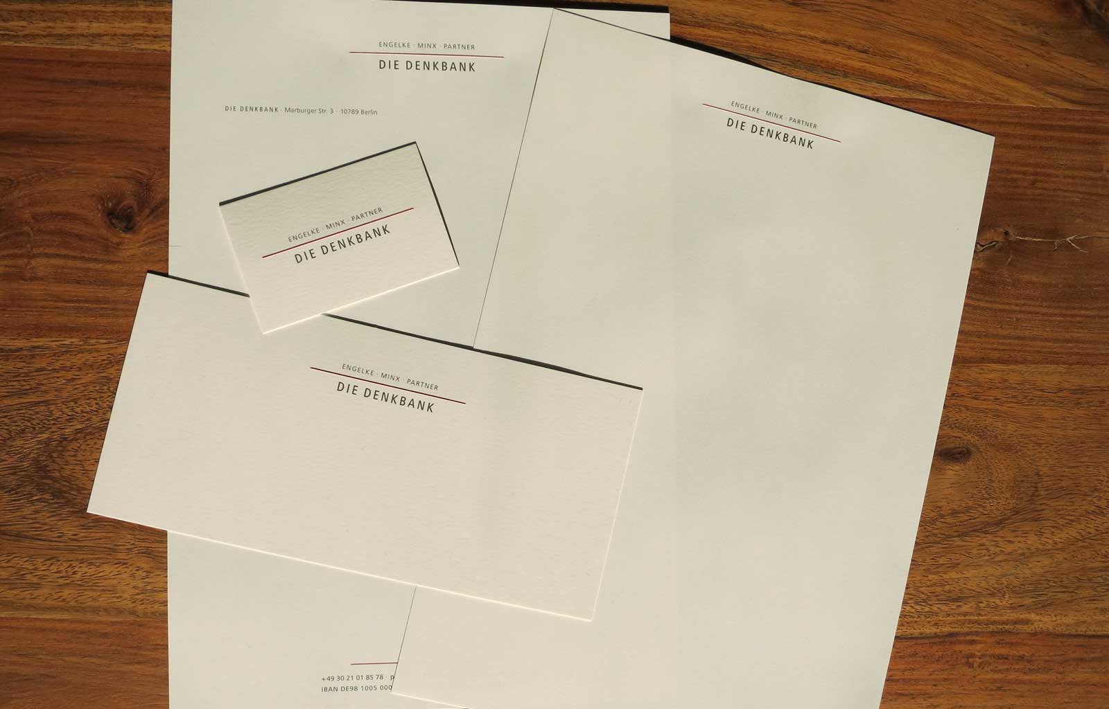
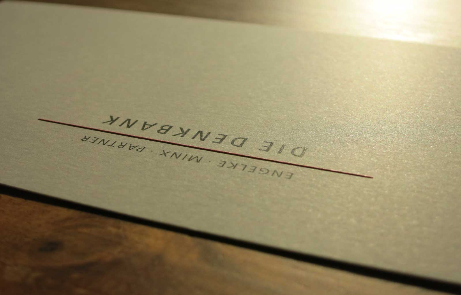
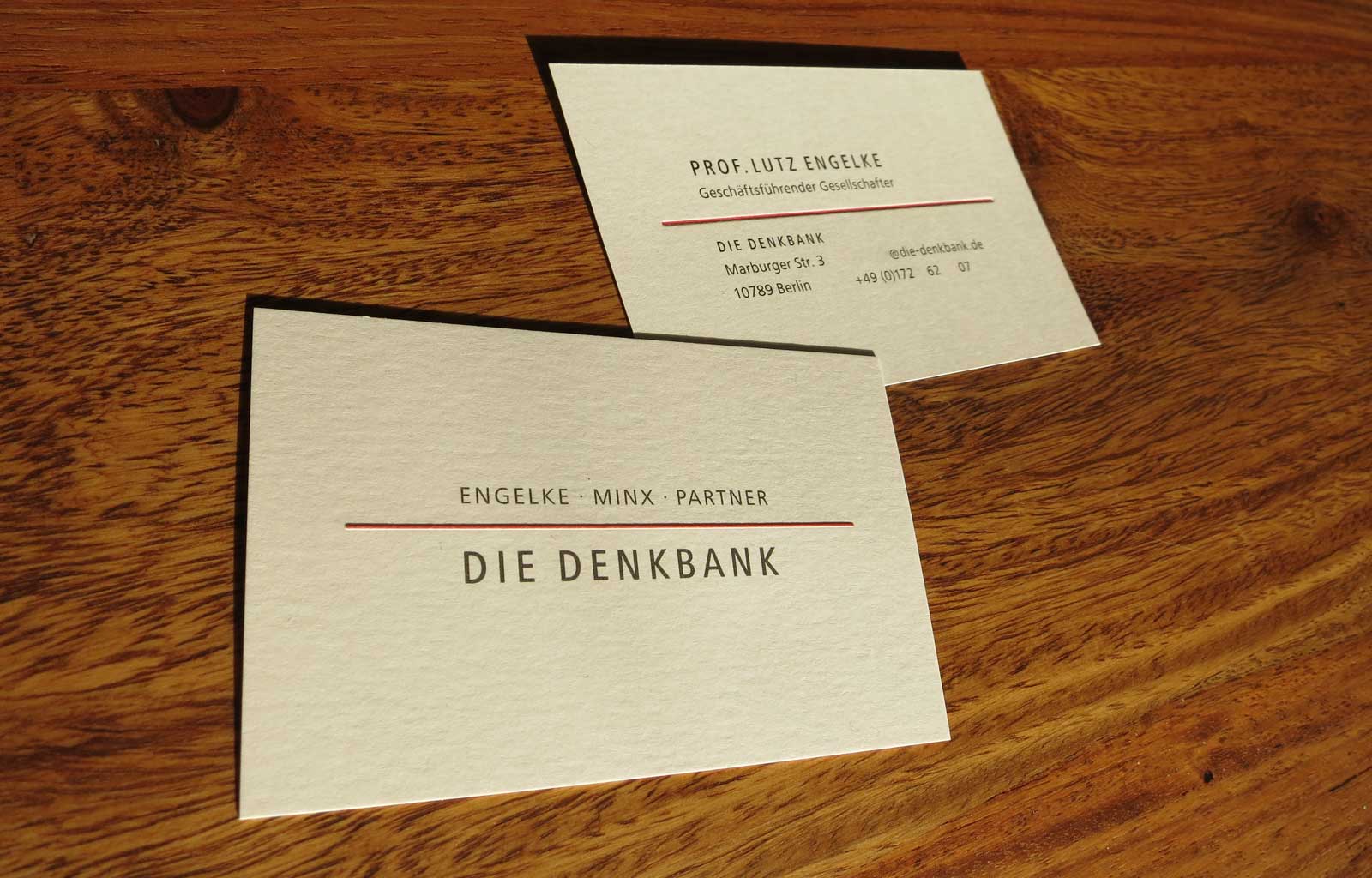
DIE DENKBANK beschäftigt sich mit Organisationsformen, deren Probleme und Fragestellungen und entwickelt im Umgang damit ein mögliches Wissen auf Vorrat. As part of a reorientation, thign revises its corporate design and completely redesigned its office stationery. The logo gets more conciseness by reduction to the word mark DIE DENKBANK and accentuation of the red line. A high-quality overall impression is achieved by blind embossing the red line as Connecting Link on all printed matter and using the finest paper Römerturm Fuktional Weiß.
Business cards, stationery and Compliment Card form a creative and haptic unit. Minimalism in design leaves free space for thought and text. A suitable Word template for letterhead and the next page and a PowerPoint template for presentations complete the overall appearance.
Client
- Die Denkbank